taskwise stim effect
roi_list <- c('rINS', 'TPJ', 'dACC', 'PHG', 'V1', 'SM', 'MT', 'RSC', 'LOC', 'FFC', 'PIT', 'pSTS', 'AIP', 'premotor')
run_types <- c("pain", "vicarious", "cognitive")
  plot_list <- list()
  TR_length <- 42
for (ROI in roi_list) {

    datadir = file.path(main_dir, "analysis/fmri/spm/fir/ttl2par")
 taskname = 'pain'
exclude <- "sub-0001"
filename <- paste0("sub-*",  "*roi-", ROI, "_tr-42.csv")
  common_path <- Sys.glob(file.path(datadir, "sub-*",  filename
  ))
  filter_path <- common_path[!str_detect(common_path, pattern = exclude)]

df <- do.call("rbind.fill", lapply(filter_path, FUN = function(files) {
    read.table(files, header = TRUE, sep = ",")
    }))

for (run_type in run_types) {
  print(run_type)
  filtered_df <- df[!(df$condition == "rating" | df$condition == "cue" | df$runtype != run_type), ]

  parsed_df <- filtered_df %>%
    separate(condition, into = c("cue", "stim"), sep = "_", remove = FALSE)
  # --------------------- subset regions based on ROI ----------------------------
  df_long <- pivot_longer(parsed_df, cols = starts_with("tr"), names_to = "tr_num", values_to = "tr_value")

  # ----------------------------- clean factor -----------------------------------
  df_long$tr_ordered <- factor(
          df_long$tr_num,
          levels = c(paste0("tr", 1:TR_length))
      )
  df_long$stim_ordered <- factor(
          df_long$stim,
          levels = c("stimH", "stimM", "stimL")
      )

  # --------------------------- summary statistics -------------------------------
  subjectwise <- meanSummary(df_long,
                                        c("sub","tr_ordered", "stim_ordered"), "tr_value")
  groupwise <- summarySEwithin(
    data = subjectwise,
    measurevar = "mean_per_sub",
    withinvars = c( "stim_ordered", "tr_ordered"),
    idvar = "sub"
  )
  groupwise$task <- run_type
  # https://stackoverflow.com/questions/29402528/append-data-frames-together-in-a-for-loop/29419402

  # ... Rest of your data processing code ...

  # subset <- groupwise[groupwise$runtype == run_type, ]
  LINEIV1 = "tr_ordered"
  LINEIV2 = "stim_ordered"
  MEAN = "mean_per_sub_norm_mean"
  ERROR = "se"
  dv_keyword = "actual"
  sorted_indices <- order(groupwise$tr_ordered)
  groupwise_sorted <- groupwise[sorted_indices, ]
  p1 <- plot_timeseries_bar(groupwise_sorted,
                            LINEIV1, LINEIV2, MEAN, ERROR,
                            xlab = "TRs",
                            ylab = paste0(ROI, " activation (A.U.)"),
                            ggtitle = paste0(ROI, ": ",run_type, " (N = ", length(unique(subjectwise$sub)),") time series, Epoch - stimulus"),
                            color = c("#5f0f40","#ae2012", "#fcbf49"))
  time_points <- seq(1, 0.46 * TR_length, 0.46)
  #p1 <- p1 + scale_x_discrete(labels = setNames(time_points, colnames(df_long)[7:(7 + TR_length)])) + theme_classic()

  plot_list[[run_type]] <- p1 + theme_classic()
}

  # --------------------------- plot three tasks -------------------------------
library(gridExtra)
plot_list <- lapply(plot_list, function(plot) {
  plot + theme(plot.margin = margin(5, 5, 5, 5))  # Adjust plot margins if needed
})
combined_plot <- ggpubr::ggarrange(plot_list[["pain"]],plot_list[["vicarious"]],plot_list[["cognitive"]],
                  common.legend = TRUE,legend = "bottom", ncol = 3, nrow = 1,
                  widths = c(3, 3, 3), heights = c(.5,.5,.5), align = "v")
combined_plot
ggsave(file.path(save_dir, paste0("roi-", ROI,"_epoch-stim_desc-highstimGTlowstim.png")), combined_plot, width = 12, height = 4)

}
## [1] "pain"
## [1] "vicarious"
## [1] "cognitive"
##
## Attaching package: 'gridExtra'
## The following object is masked from 'package:dplyr':
##
##     combine
## [1] "pain"
## [1] "vicarious"
## [1] "cognitive"
## [1] "pain"
## [1] "vicarious"
## [1] "cognitive"
## [1] "pain"
## [1] "vicarious"
## [1] "cognitive"
## [1] "pain"
## [1] "vicarious"
## [1] "cognitive"
## [1] "pain"
## [1] "vicarious"
## [1] "cognitive"
## [1] "pain"
## [1] "vicarious"
## [1] "cognitive"
## [1] "pain"
## [1] "vicarious"
## [1] "cognitive"
## [1] "pain"
## [1] "vicarious"
## [1] "cognitive"
## [1] "pain"
## [1] "vicarious"
## [1] "cognitive"
## [1] "pain"
## [1] "vicarious"
## [1] "cognitive"
## [1] "pain"
## [1] "vicarious"
## [1] "cognitive"
## [1] "pain"
## [1] "vicarious"
## [1] "cognitive"
## [1] "pain"
## [1] "vicarious"
## [1] "cognitive"
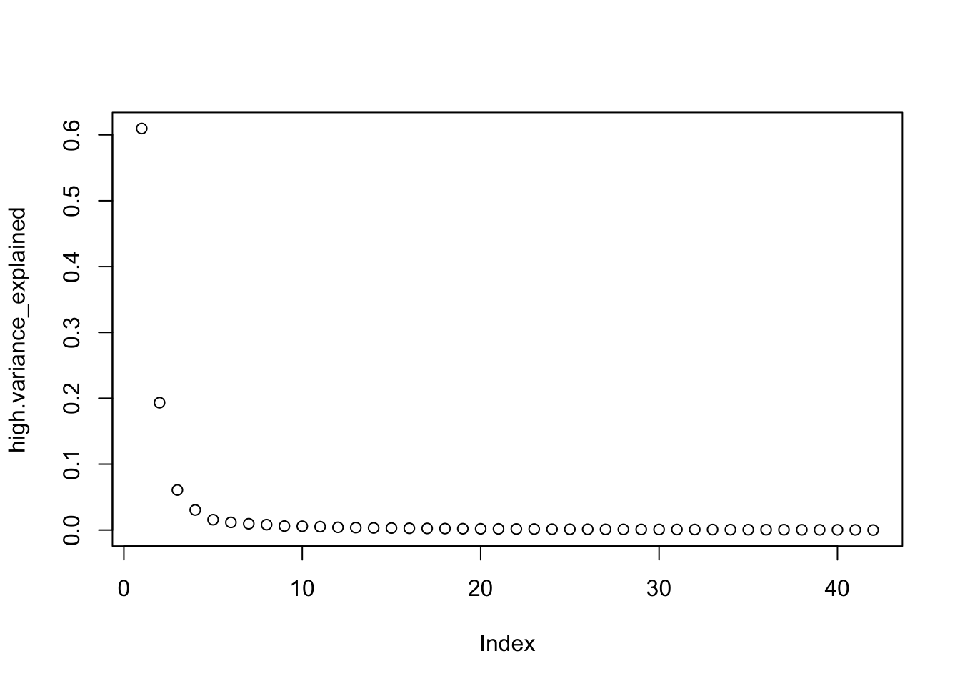
PCA subjectwise
# install.packages("ggplot2")    # Install ggplot2 if you haven't already
# install.packages("FactoMineR") # Install FactoMineR if you haven't already
library(ggplot2)
library(FactoMineR)
run_types = c("pain")
for (run_type in run_types) {
  print(run_type)
  filtered_df <- df[!(df$condition == "rating" | df$condition == "cue" | df$runtype != run_type), ]

  parsed_df <- filtered_df %>%
    separate(condition, into = c("cue", "stim"), sep = "_", remove = FALSE)
  # --------------------- subset regions based on ROI ----------------------------
  df_long <- pivot_longer(parsed_df, cols = starts_with("tr"), names_to = "tr_num", values_to = "tr_value")

  # ----------------------------- clean factor -----------------------------------
  df_long$tr_ordered <- factor(
          df_long$tr_num,
          levels = c(paste0("tr", 1:TR_length))
      )
  df_long$stim_ordered <- factor(
          df_long$stim,
          levels = c("stimH", "stimM", "stimL")
      )

  # --------------------------- summary statistics -------------------------------
  subjectwise <- meanSummary(df_long,
                                        c("sub","tr_ordered", "stim_ordered"), "tr_value")

# Assuming your original dataframe is named 'df'

# Convert the dataframe to wide format
df_wide <- pivot_wider(subjectwise,
                       id_cols = c("tr_ordered", "stim_ordered"),
                       names_from = c("sub"),
                       values_from = "mean_per_sub")

# df_wide <- pivot_wider(subjectwise,
#                        id_cols = c("sub", "ROIindex","stim_ordered"),
#                        names_from = "tr_ordered",
#                        values_from = "mean_per_sub")
stim_high.df <- df_wide[df_wide$stim_ordered == "stimH",]
stim_med.df <- df_wide[df_wide$stim_ordered == "stimM",]
stim_low.df <- df_wide[df_wide$stim_ordered == "stimL",]
# selected_columns <- subset(stim_high.df, select = 2:(ncol(stim_high.df) - 1))
meanhighdf <- data.frame(subset(stim_high.df, select = 3:(ncol(stim_high.df) - 1)))
high.pca_result <- prcomp(meanhighdf)
high.pca_scores <- as.data.frame(high.pca_result$x)
# Access the proportion of variance explained by each principal component
high.variance_explained <- high.pca_result$sdev^2 / sum(high.pca_result$sdev^2)
plot(high.variance_explained)
# Access the standard deviations of each principal component
high.stdev <- high.pca_result$sdev

meanmeddf <- data.frame(subset(stim_med.df, select = 3:(ncol(stim_med.df) - 1)))
med.pca <- prcomp(meanmeddf)
med.pca_scores <- as.data.frame(med.pca$x)

meanlowdf <- data.frame(subset(stim_low.df, select = 3:(ncol(stim_low.df) - 1)))
low.pca <- prcomp(meanlowdf)
low.pca_scores <- as.data.frame(low.pca$x)
library(plotly)  # You can use plotly to create an interactive 3D plot
# plot_ly(high.pca_scores, x = ~PC1, y = ~PC2, z = ~PC3, type = "scatter3d", mode = "markers")
# plot_ly(low.pca_scores, x = ~PC1, y = ~PC2, z = ~PC3, type = "scatter3d", mode = "markers")
combined_pca_scores <- rbind(high.pca_scores, med.pca_scores, low.pca_scores)

# Add a new column to indicate the stim_ordered category (high_stim or low_stim)
combined_pca_scores$stim_ordered <- c(rep("high_stim", nrow(high.pca_scores)),
                                      rep("med_stim", nrow(med.pca_scores)),
                                      rep("low_stim", nrow(low.pca_scores)))

# Create the 3D PCA plot
plot_ly(combined_pca_scores, x = ~PC1, y = ~PC2, z = ~PC3, type = "scatter3d", mode = "markers",
        color = ~stim_ordered)
# data_matrix <- groupwise[groupwise$stim_ordered == "high_stim",c("tr_ordered", "mean_per_sub_norm_mean")]
# sorted_indices <- order(data_matrix$tr_ordered)
# df_ordered <- data_matrix[sorted_indices, ]
# pca_result <- PCA(data_matrix$mean_per_sub_norm_mean)
# datapoints <- df$datapoints
}
## [1] "pain"
##
## Attaching package: 'plotly'
## The following object is masked from 'package:ggplot2':
##
##     last_plot
## The following objects are masked from 'package:plyr':
##
##     arrange, mutate, rename, summarise
## The following object is masked from 'package:reshape':
##
##     rename
## The following object is masked from 'package:stats':
##
##     filter
## The following object is masked from 'package:graphics':
##
##     layout
plot_ly(combined_pca_scores, x = ~PC1, y = ~PC2, z = ~PC3, type = "scatter3d", mode = "markers",
        color = ~stim_ordered)
PCA groupwise
# install.packages("ggplot2")    # Install ggplot2 if you haven't already
# install.packages("FactoMineR") # Install FactoMineR if you haven't already
library(ggplot2)
library(FactoMineR)


# Assuming your original dataframe is named 'df'

# Convert the dataframe to wide format
df_wide.group <- pivot_wider(subjectwise,
                       id_cols = c("tr_ordered", "stim_ordered"),
                       names_from = "sub",
                       values_from = "mean_per_sub")
# ------
# data_matrix <- groupwise[groupwise$stim_ordered == "high_stim",c("tr_ordered", "mean_per_sub_norm_mean")]
# sorted_indices <- order(data_matrix$tr_ordered)
# df_ordered <- data_matrix[sorted_indices, ]
# datapoints <- df_ordered$mean_per_sub_norm_mean
# data_df <- data.frame(Dim1 = datapoints, Dim2 = datapoints, Dim3 = datapoints)
# pca <- prcomp(data_df)
# pca_scores <- as.data.frame(pca$x)
# plot_ly(pca_scores, x = ~PC1, y = ~PC2, z = ~PC3, type = "scatter3d", mode = "markers")
# -------
stim_high.df <- df_wide[df_wide$stim_ordered == "stimH",]
stim_low.df <- df_wide[df_wide$stim_ordered == "stimL",]
# selected_columns <- subset(stim_high.df, select = 2:(ncol(stim_high.df) - 1))
meanhighdf <- data.frame(subset(stim_high.df, select = 3:(ncol(stim_high.df) - 1)))
high.pca <- prcomp(meanhighdf)
high.pca_scores <- as.data.frame(high.pca$x)

meanlowdf <- data.frame(subset(stim_low.df, select = 3:(ncol(stim_low.df) - 1)))
low.pca <- prcomp(meanlowdf)
low.pca_scores <- as.data.frame(low.pca$x)
library(plotly)  # You can use plotly to create an interactive 3D plot
# plot_ly(high.pca_scores, x = ~PC1, y = ~PC2, z = ~PC3, type = "scatter3d", mode = "markers")
# plot_ly(low.pca_scores, x = ~PC1, y = ~PC2, z = ~PC3, type = "scatter3d", mode = "markers")
combined_pca_scores <- rbind(high.pca_scores, low.pca_scores)

# Add a new column to indicate the stim_ordered category (high_stim or low_stim)
combined_pca_scores$stim_ordered <- c(rep("high_stim", nrow(high.pca_scores)), rep("low_stim", nrow(low.pca_scores)))

# Create the 3D PCA plot
plot_ly(combined_pca_scores, x = ~PC1, y = ~PC2, z = ~PC3, type = "scatter3d", mode = "markers",
        color = ~stim_ordered)
## Warning in RColorBrewer::brewer.pal(N, "Set2"): minimal value for n is 3, returning requested palette with 3 different levels

## Warning in RColorBrewer::brewer.pal(N, "Set2"): minimal value for n is 3, returning requested palette with 3 different levels
# data_matrix <- groupwise[groupwise$stim_ordered == "high_stim",c("tr_ordered", "mean_per_sub_norm_mean")]
# sorted_indices <- order(data_matrix$tr_ordered)
# df_ordered <- data_matrix[sorted_indices, ]
# pca_result <- PCA(data_matrix$mean_per_sub_norm_mean)
# datapoints <- df$datapoints
# Assuming you have a dataframe named 'data' containing the 20 data points, 'x' and 'y' values, and corresponding standard deviations 'sd'
# Load the ggplot2 library
# install.packages("ggplot2")
library(ggplot2)
# Create the plot
# y = "mean_per_sub_mean"z
# combined_pca <- combined_pca_scores %>%
# mutate(group_index = group_indices(., stim_ordered))
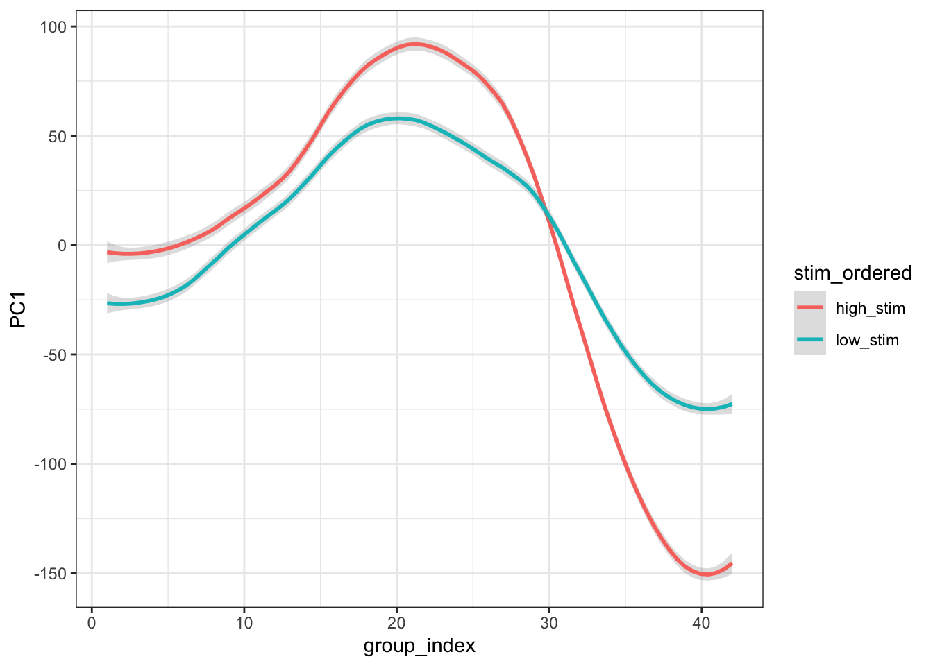
combined_pca <- combined_pca_scores %>%
group_by(stim_ordered) %>%
mutate(group_index = row_number())
ggplot(combined_pca, aes(x=group_index,y=PC1, group = stim_ordered, colour=stim_ordered)) +
stat_smooth(method="loess", span=0.25, se=TRUE, aes(color=stim_ordered), alpha=0.3) +
theme_bw()
## `geom_smooth()` using formula = 'y ~ x'
# Assuming you have a dataframe named 'data' containing the 20 data points, 'x' and 'y' values, and corresponding standard deviations 'sd'
# Load the ggplot2 library
# install.packages("ggplot2")
library(ggplot2)
# Create the plot
# y = "mean_per_sub_mean"z
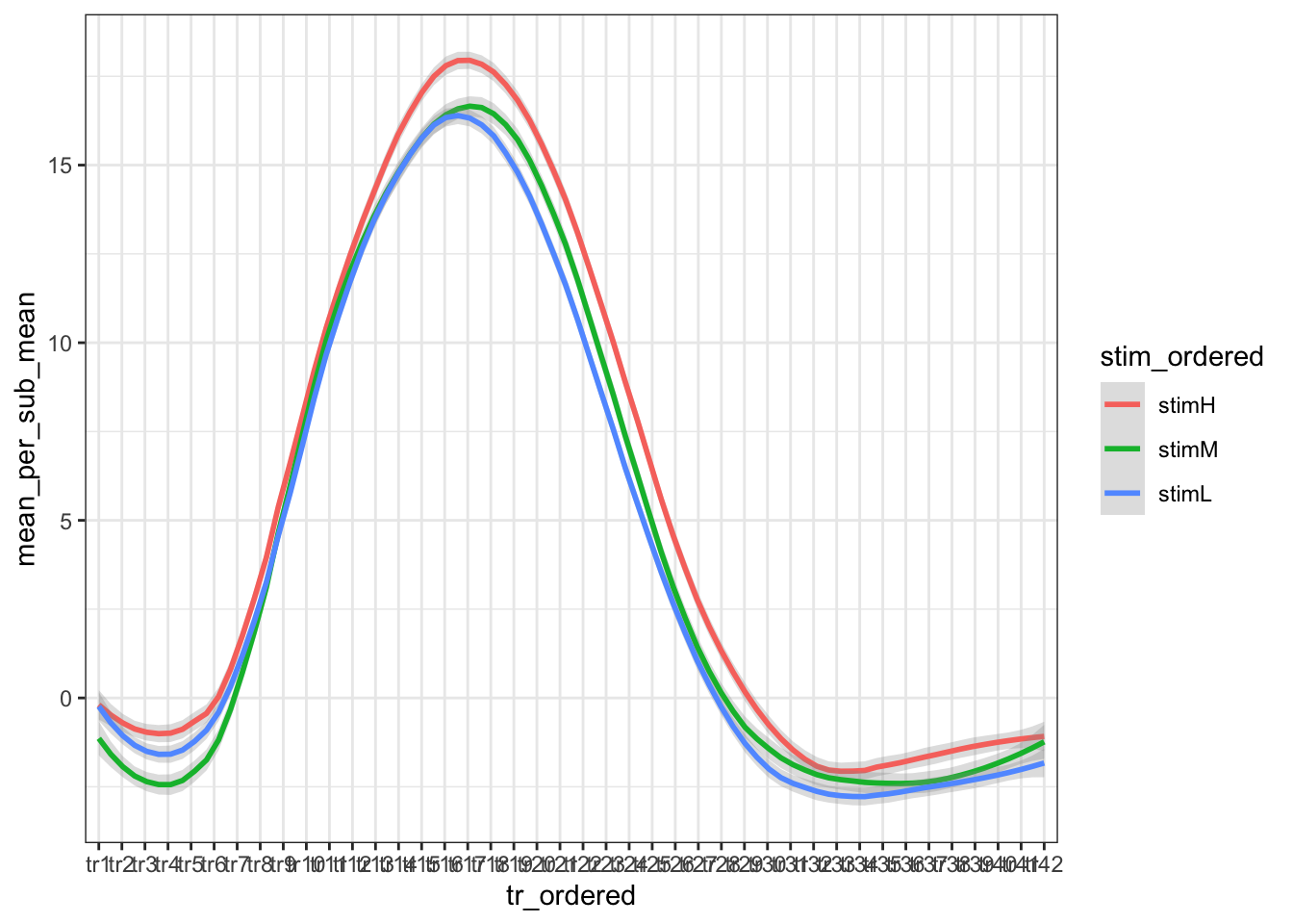
ggplot(groupwise, aes(x=tr_ordered,y=mean_per_sub_mean, group = stim_ordered, colour=stim_ordered)) +
stat_smooth(method="loess", span=0.25, se=TRUE, aes(color=stim_ordered), alpha=0.3) +
theme_bw()
## `geom_smooth()` using formula = 'y ~ x'
# ggplot(data=groupwise, aes(x=tr_ordered, y=mean_per_sub_mean, ymin=se, ymax=se, fill=stim_ordered, linetype=stim_ordered)) +
# geom_line() +
# geom_ribbon(alpha=0.5)
# Assuming you have a dataframe named 'data' containing the 20 mean data points and corresponding standard errors
# 'x' represents the x-values (e.g., time points)
# 'mean_y' represents the mean y-values
# 'se_y' represents the standard errors of the mean y-values
# Load the ggplot2 library
# install.packages("ggplot2")
library(ggplot2)
# groupwise$x <- as.numeric(groupwise$x)
#
# # Sort the dataframe by the 'x' variable (if it's not already sorted)
# data <- data[order(data$x), ]
# Create the plot
# Create the plot with custom span and smoothing method
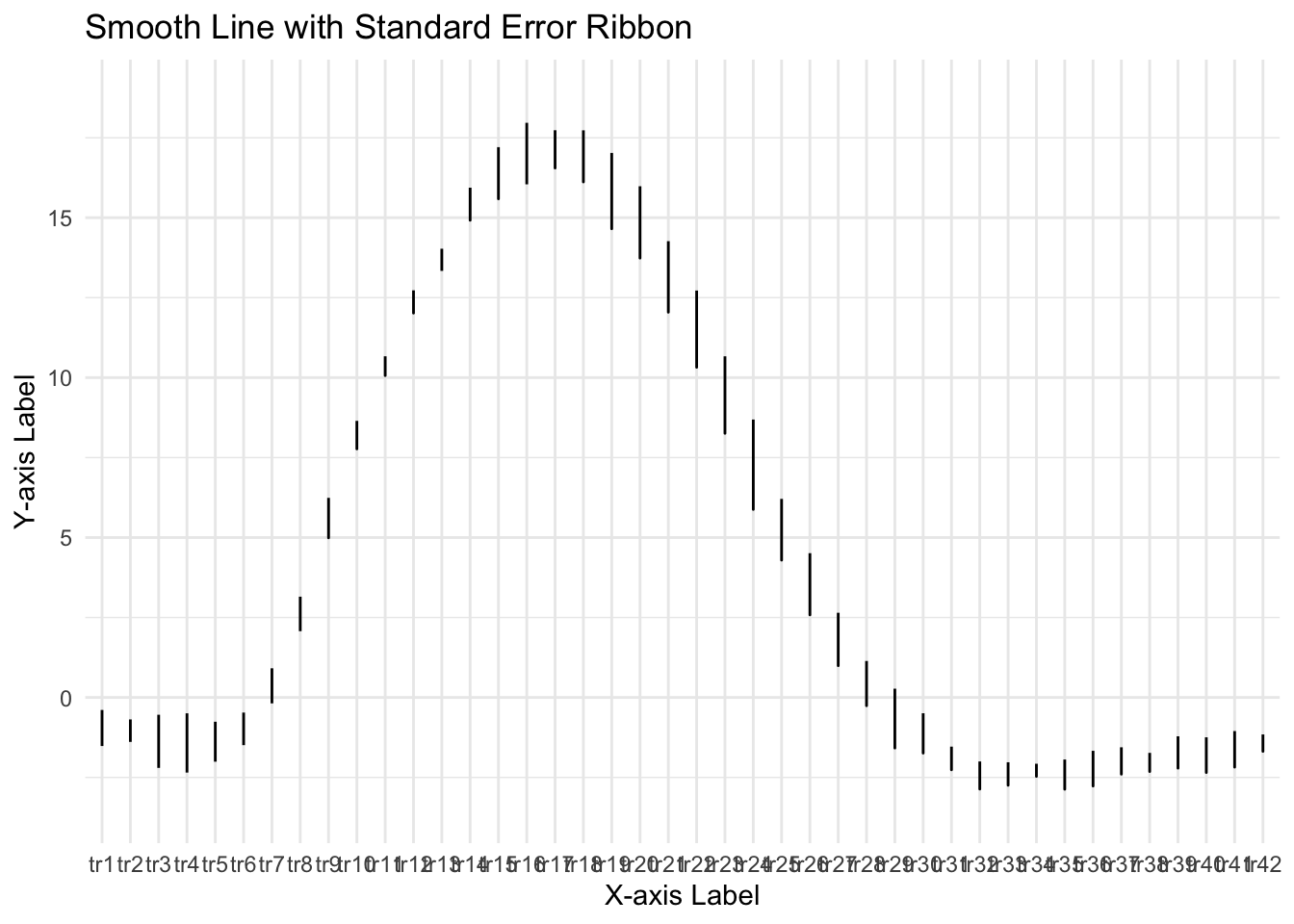
ggplot(groupwise, aes(x=tr_ordered,y=mean_per_sub_mean)) +
geom_line() + # Plot the smooth line for the mean
geom_ribbon(aes(ymin = mean_per_sub_mean - se, ymax = mean_per_sub_mean + se), alpha = 0.3) + # Add the ribbon for standard error
geom_smooth(method = "loess", span = 0.1, se = FALSE) + # Add the loess smoothing curve
labs(x = "X-axis Label", y = "Y-axis Label", title = "Smooth Line with Standard Error Ribbon") +
theme_minimal()
## `geom_smooth()` using formula = 'y ~ x'
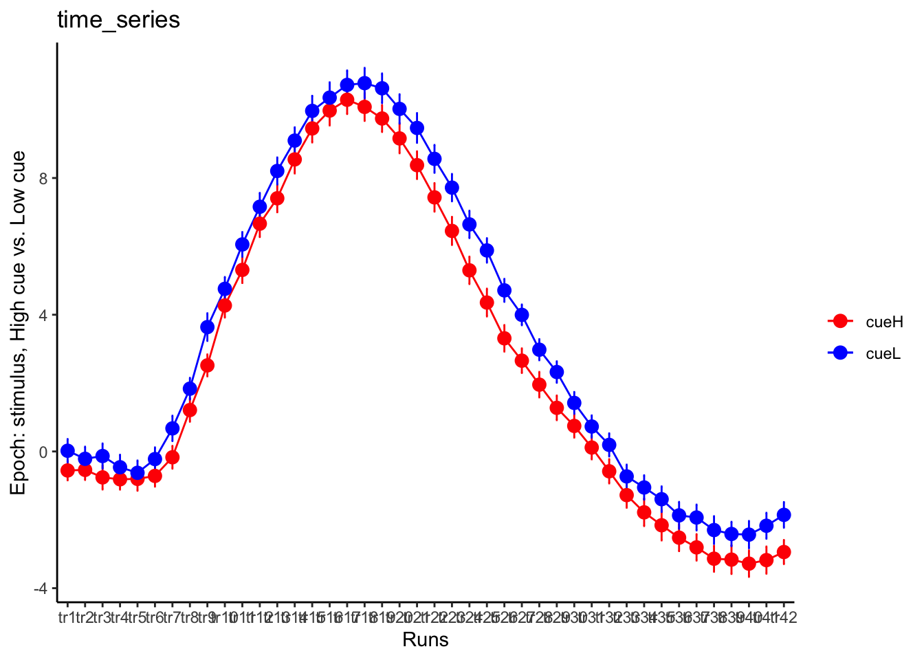
DEP: epoch: stim, high cue vs low cue
# filtered_df <- subset(df, condition != "rating")
filtered_df <- df[!(df$condition == "rating" | df$condition == "cue"), ]

parsed_df <- filtered_df %>%
  separate(condition, into = c("cue", "stim"), sep = "_", remove = FALSE)

TR_length <- 42
# --------------------- subset regions based on ROI ----------------------------
df_long <- pivot_longer(parsed_df, cols = starts_with("tr"), names_to = "tr_num", values_to = "tr_value")

# ----------------------------- clean factor -----------------------------------
df_long$tr_ordered <- factor(
        df_long$tr_num,
        levels = c(paste0("tr", 1:TR_length))
    )
df_long$cue_ordered <- factor(
        df_long$cue,
        levels = c("cueH","cueL")
    )

# --------------------------- summary statistics -------------------------------
subjectwise <- meanSummary(df_long,
                                      c("sub", "tr_ordered", "cue_ordered"), "tr_value")
groupwise <- summarySEwithin(
  data = subjectwise,
  measurevar = "mean_per_sub",
  withinvars = c("cue_ordered", "tr_ordered"),
  idvar = "sub"
)
groupwise$task <- taskname
# https://stackoverflow.com/questions/29402528/append-data-frames-together-in-a-for-loop/29419402

# --------------------------------- plot ---------------------------------------
LINEIV1 = "tr_ordered"
LINEIV2 = "cue_ordered"
MEAN = "mean_per_sub_norm_mean"
ERROR = "se"
dv_keyword = "actual"
sorted_indices <- order(groupwise$tr_ordered)
groupwise_sorted <- groupwise[sorted_indices, ]
p1 = plot_timeseries_bar(groupwise,
               LINEIV1, LINEIV2, MEAN, ERROR,  xlab = "Runs" , ylab= "Epoch: stimulus, High cue vs. Low cue", ggtitle="time_series", color=c("red", "blue"))
time_points <- seq(1, 0.46 * TR_length, 0.46)
p1 + scale_x_discrete(labels = setNames(time_points, colnames(df_long)[7:7+TR_length]))+ theme_classic()
taskwise cue effect
roi_list <- c('rINS', 'TPJ', 'dACC', 'PHG', 'V1', 'SM', 'MT', 'RSC', 'LOC', 'FFC', 'PIT', 'pSTS', 'AIP', 'premotor')
for (ROI in roi_list) {

    datadir = file.path(main_dir, "analysis/fmri/spm/fir/ttl2par")
# taskname = 'pain'
exclude <- "sub-0001"
filename <- paste0("sub-*",  "*roi-", ROI, "_tr-42.csv")
  common_path <- Sys.glob(file.path(datadir, "sub-*",  filename
  ))
  filter_path <- common_path[!str_detect(common_path, pattern = exclude)]

df <- do.call("rbind.fill", lapply(filter_path, FUN = function(files) {
    read.table(files, header = TRUE, sep = ",")
    }))


run_types <- c("pain", "vicarious", "cognitive")
  plot_list <- list()
  TR_length <- 42
for (run_type in run_types) {
  filtered_df <- df[!(df$condition == "rating" | df$condition == "cue" | df$runtype != run_type), ]

  parsed_df <- filtered_df %>%
    separate(condition, into = c("cue", "stim"), sep = "_", remove = FALSE)
  # --------------------- subset regions based on ROI ----------------------------
  df_long <- pivot_longer(parsed_df, cols = starts_with("tr"), names_to = "tr_num", values_to = "tr_value")

  # ----------------------------- clean factor -----------------------------------
  df_long$tr_ordered <- factor(
          df_long$tr_num,
          levels = c(paste0("tr", 1:TR_length))
      )
df_long$cue_ordered <- factor(
        df_long$cue,
        levels = c("cueH","cueL")
    )

  # --------------------------- summary statistics -------------------------------
  subjectwise <- meanSummary(df_long,
                                        c("sub","tr_ordered", "cue_ordered"), "tr_value")
  groupwise <- summarySEwithin(
    data = subjectwise,
    measurevar = "mean_per_sub",
    withinvars = c( "cue_ordered", "tr_ordered"),
    idvar = "sub"
  )
  groupwise$task <- run_type
  # https://stackoverflow.com/questions/29402528/append-data-frames-together-in-a-for-loop/29419402

  # ... Rest of your data processing code ...

  # subset <- groupwise[groupwise$runtype == run_type, ]
  LINEIV1 = "tr_ordered"
  LINEIV2 = "cue_ordered"
  MEAN = "mean_per_sub_norm_mean"
  ERROR = "se"
  dv_keyword = "actual"
  sorted_indices <- order(groupwise$tr_ordered)
  groupwise_sorted <- groupwise[sorted_indices, ]
  p1 <- plot_timeseries_bar(groupwise_sorted,
                            LINEIV1, LINEIV2, MEAN, ERROR,
                            xlab = "TRs",
                            ylab = paste0(ROI, " activation (A.U.)"),
                            ggtitle = paste0(run_type, " time series, Epoch - stimulus"),
                            color =c("red", "blue"))
  time_points <- seq(1, 0.46 * TR_length, 0.46)
  #p1 <- p1 + scale_x_discrete(labels = setNames(time_points, colnames(df_long)[7:(7 + TR_length)])) + theme_classic()

  plot_list[[run_type]] <- p1 + theme_classic()
}

  # --------------------------- plot three tasks -------------------------------
library(gridExtra)
plot_list <- lapply(plot_list, function(plot) {
  plot + theme(plot.margin = margin(5, 5, 5, 5))  # Adjust plot margins if needed
})
combined_plot <- ggpubr::ggarrange(plot_list[["pain"]],plot_list[["vicarious"]],plot_list[["cognitive"]],
                  common.legend = TRUE,legend = "bottom", ncol = 3, nrow = 1,
                  widths = c(3, 3, 3), heights = c(.5,.5,.5), align = "v")
combined_plot
ggsave(file.path(save_dir, paste0("roi-", ROI, "_epoch-stim_desc-highcueGTlowcue.png")), combined_plot, width = 12, height = 4)
}
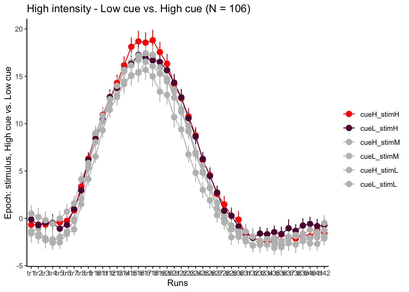
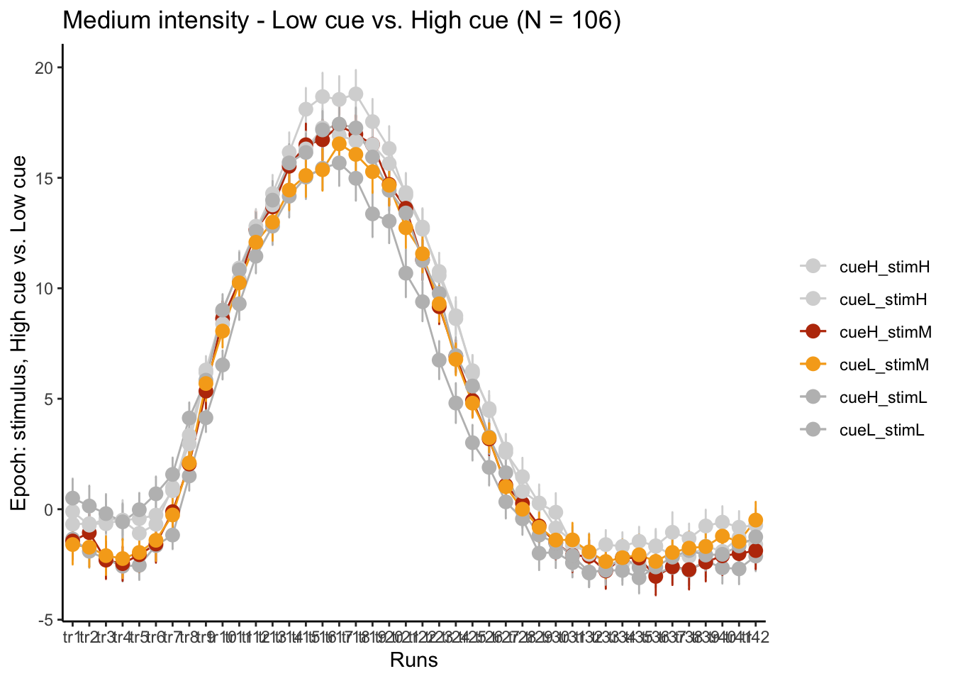
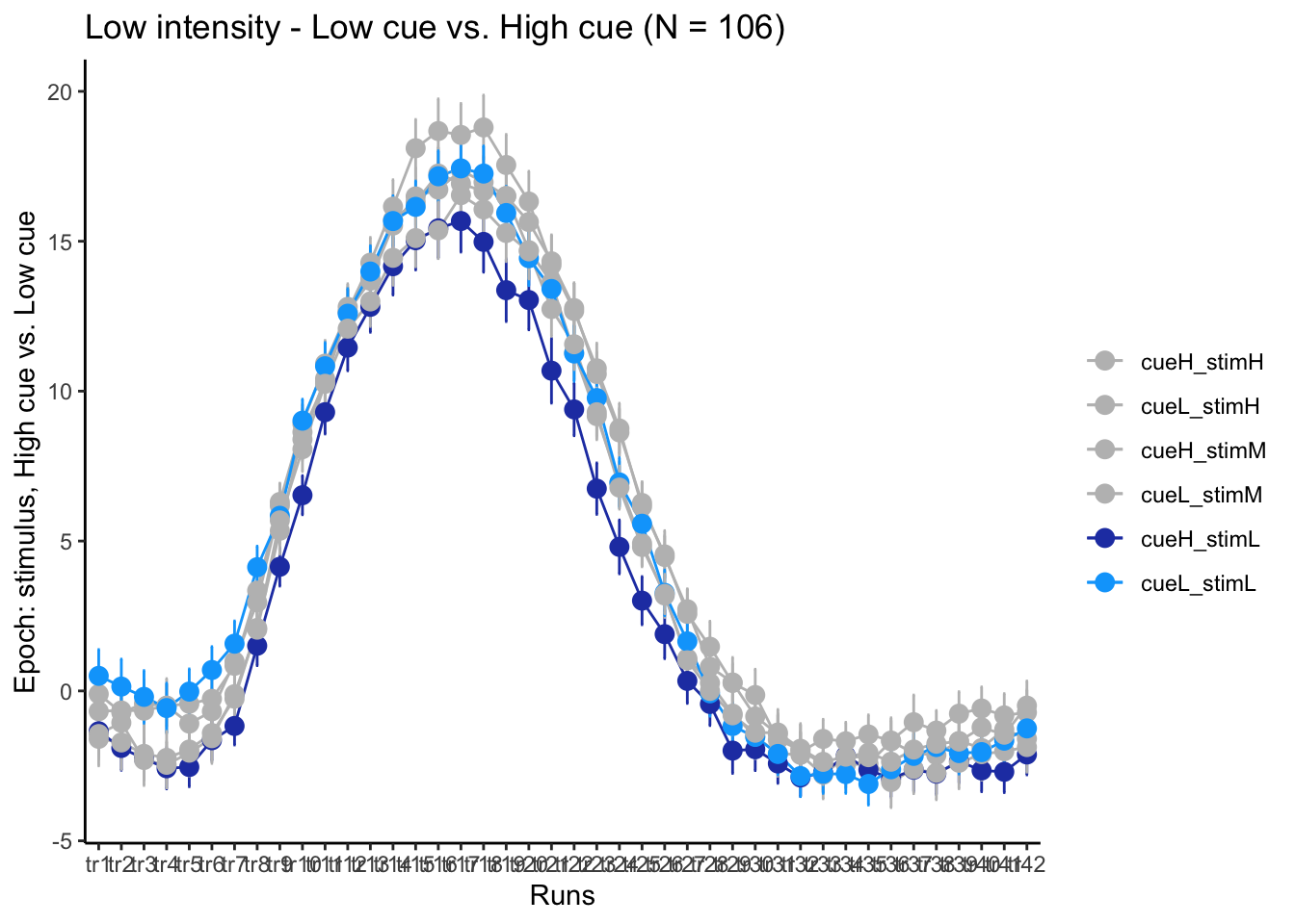
epoch: 6 cond
# ------------------------------------------------------------------------------
#                       epoch stim, high cue vs low cue
# ------------------------------------------------------------------------------
# --------------------- subset regions based on ROI ----------------------------

# ----------------------------- clean factor -----------------------------------
df_long$tr_ordered <- factor(
        df_long$tr_num,
        levels = c(paste0("tr", 1:TR_length))
    )
df_long$cue_ordered <- factor(
        df_long$cue,
        levels = c("cueH", "cueL")
    )
df_long$stim_ordered <- factor(
        df_long$stim,
        levels = c("stimH", "stimM", "stimL")
    )

df_long$sixcond <- factor(
        df_long$condition,
        levels = c("cueH_stimH", "cueL_stimH",
                   "cueH_stimM", "cueL_stimM",
                   "cueH_stimL", "cueL_stimL")
)
# --------------------------- summary statistics -------------------------------
subjectwise <- meanSummary(df_long,
                                      c("sub", "tr_ordered", "sixcond"), "tr_value")
groupwise <- summarySEwithin(
  data = subjectwise,
  measurevar = "mean_per_sub",
  withinvars = c("sixcond", "tr_ordered"),
  idvar = "sub"
)
groupwise$task <- taskname
# https://stackoverflow.com/questions/29402528/append-data-frames-together-in-a-for-loop/29419402

# --------------------------------- plot ---------------------------------------
LINEIV1 = "tr_ordered"
LINEIV2 = "sixcond"
MEAN = "mean_per_sub_norm_mean"
ERROR = "se"
dv_keyword = "actual"
sorted_indices <- order(groupwise$tr_ordered)
groupwise_sorted <- groupwise[sorted_indices, ]
p3H = plot_timeseries_bar(groupwise,
               LINEIV1, LINEIV2, MEAN, ERROR,  xlab = "Runs" , ylab= "Epoch: stimulus, High cue vs. Low cue", ggtitle=paste0("High intensity - Low cue vs. High cue (N = ", unique(groupwise$N), ")" ), color=c("red","#5f0f40","gray", "gray", "gray", "gray"))
time_points <- seq(1, 0.46 * TR_length, 0.46)
p3H + scale_x_discrete(labels = setNames(time_points, colnames(df_long)[7:7+TR_length]))+ theme_classic()
p3M = plot_timeseries_bar(groupwise,
               LINEIV1, LINEIV2, MEAN, ERROR,  xlab = "Runs" , ylab= "Epoch: stimulus, High cue vs. Low cue", ggtitle=paste0("Medium intensity - Low cue vs. High cue (N = ", unique(groupwise$N), ")"), color=c("#d6d6d6","#d6d6d6","#bc3908", "#f6aa1c", "gray", "gray"))
time_points <- seq(1, 0.46 * TR_length, 0.46)
p3M + scale_x_discrete(labels = setNames(time_points, colnames(df_long)[7:7+TR_length]))+ theme_classic()
p3L = plot_timeseries_bar(groupwise,
               LINEIV1, LINEIV2, MEAN, ERROR,  xlab = "Runs" , ylab= "Epoch: stimulus, High cue vs. Low cue", ggtitle=paste0("Low intensity - Low cue vs. High cue (N = ", unique(groupwise$N), ")"), color=c("gray","gray","gray", "gray", "#2541b2", "#00a6fb"))
time_points <- seq(1, 0.46 * TR_length, 0.46)
p3L + scale_x_discrete(labels = setNames(time_points, colnames(df_long)[7:7+TR_length]))+ theme_classic()